On Monday we changed the way our calculator stored its information about the Earth. Until then, the data describing elevation, temperature and solar radiation had been hidden inside several binary files which the program could interpret without difficulty, but which a human being could not inspect without wondering why he had been chosen for the experience. Open one of them with an ordinary program and you were rewarded with a wall of characters that appeared to have no particular meaning.
Technically, there was nothing wrong with this arrangement. From a human point of view, however, the data had become almost impossible to inspect.
So we did something very simple: we turned it into pictures.
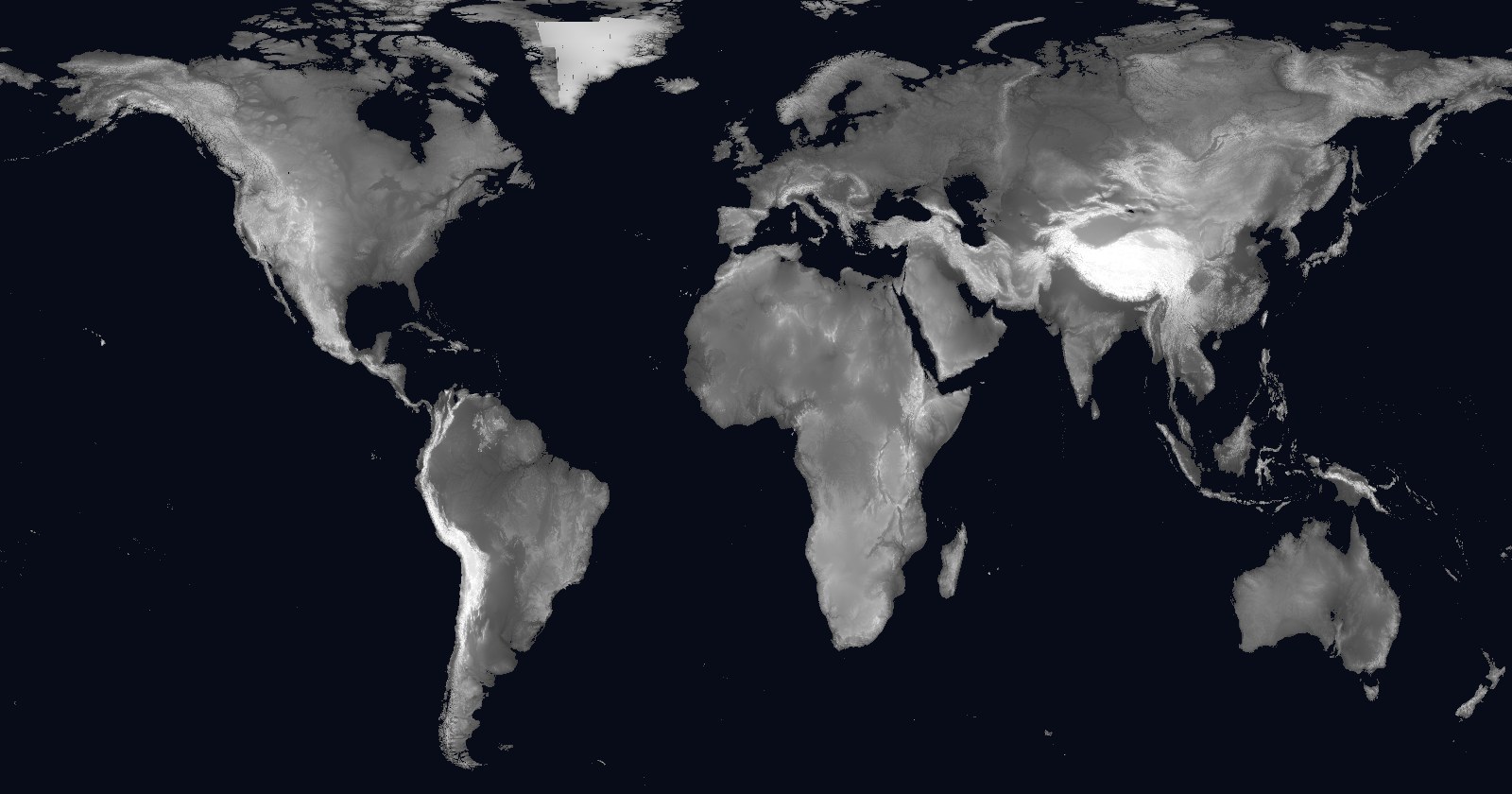
The elevation map of the Earth became a 3600 x 1800 pixel PNG, with each pixel representing roughly ten kilometres of terrain and its shade of grey indicating elevation. The sea is black, the plains occupy various shades of grey, and the mountainous regions become progressively lighter until the Himalayas are almost white. It is not a representation that can replace the original data when precision is required, but it has one considerable advantage: almost any image program can open it, and you can immediately see what the data represents.
We applied the same principle to temperature. We produced one map for each month and placed all twelve into a single image, from January through December. Viewed together, they show something that is surprisingly difficult to appreciate in a table of numbers: summer is not simply present in one part of the world and absent from another. It appears to travel slowly between the two hemispheres as the Earth continues its journey around the Sun.
The change also allowed us to remove a less visible problem.
Until then, whenever a user moved the pin on the map, the calculator sent the coordinates to an internet service and asked for the elevation at that particular point. It was a reasonable solution when we needed a single location, but it became rather absurd when the user moved the pin repeatedly. Every movement generated another request to a server which had no particular reason to know that we were moving a point around on our map.
Now the elevation is already in the picture.
The calculator identifies the pixel corresponding to the position of the pin and reads the value from it. There is no longer any need for an external service, and the function continues to work even when there is no internet connection. These are the improvements that seem insignificant after they have been made and considerably less insignificant while you are making them.
In the evening we started something more ambitious: a global map of solar radiation, divided into one-degree by one-degree cells.
For every cell over land, three processes would ask PVGIS what values were available there. For the oceans and polar regions we needed other data, so NASA would be questioned again, this time in batches of one hundred points.
It was not a complicated algorithm. There was simply a great deal of work to be done.
The calculation would take several days, which meant that three virtual workers would repeat the same operation an extremely large number of times without becoming tired and, more importantly, without asking for coffee.
If everything worked, the result would be another picture of the Earth, except that this time we would not be representing its terrain or its temperature.
We would be representing its light.
Until then, information about our planet had been something the calculator had to read and interpret. From Monday onward, it was becoming something that could also be looked at.
And that turned out to be a more important distinction than it seemed at first. Once you can see the data, you begin to notice things you would never have thought to look for in a binary file.